Pages in [Legacy] Mod Levels

CTF-Niven20..
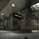
DMN-EscapeF..
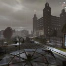
DMN-Ministr..

DMN-Lazywat..
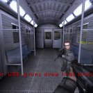
DMN-Aldwych..
AIM-IT Tact..
Unreal 1 Le..
DMN-Lazywater
My first map I made for the unreal 2 engine (ut2003) and for the Domain 2049 mod.
A curved dam site holds water for a town. Rebels occupied the water plant and contaminated the water. They now can complete their mission by opening two valves and flood a big area with poisoned water.
A group of local guys tries to stop them. They need to broadcast a message so a security lock can be closed.
Award: Finalist in the first phase of the Make Something Unreal Contest and honorable mentioned in phase three.
Content:
Screenshots
This is the first level I made with the unreal editor for ut2003. It was also the first time I created content outside the editor.Cubemaps, Emitter, Materials, Terrain, Decolayers all of it wasn't present in the last engine. So it was a lot of new stuff to try out.


One of the bases. - Using textures based on photos rather than painted textures lets all Domain 2049 levels look different than other unreal engine levels.
I also think that it is a matter of the scale of the objects. A lot of content in unreal looks quite bulky and a bit overloaded with details while our levels had less details and more slender elements.
This level isn't the best example for this theory. My later levels look cleaner.


Lighting is a bit dodgy in some spots, when I look at it right now.


 Top of page
 Art assets for Domain 2049