Pages in [Legacy] More
VCTF-SlowWa..

Hellboy - P..

TOC-Pontre..
PC Action p..
Static Mesh..

Textures fo..
DMN-Ministr..
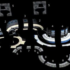
Modular Lev..
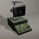
Static Mesh..
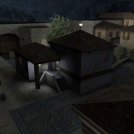
More Tactic..
VCTF-SlowWater (Making Of)
A blog about the yet unfinished VCTF-SlowWater. A level I started building with unreal 3 at the end of 2009. I would say the level has almost reached alpha but it is far from being finished.
Unfortunately I didn't have the time and energy to work on it recently. So it is only half way done.
This is work in progress!
Content:
Unfinished level!
I stopped working on this level. It would still need a lot of time to complete. Time I don't want to spend right now.First block out
This is a first blockout of one side of the symmetrical map. Done with terrain and BSP and few static meshes that come with UT3.This is just to get an idea of the size of the map. I put a tank and scorpion in to see how the size feels.
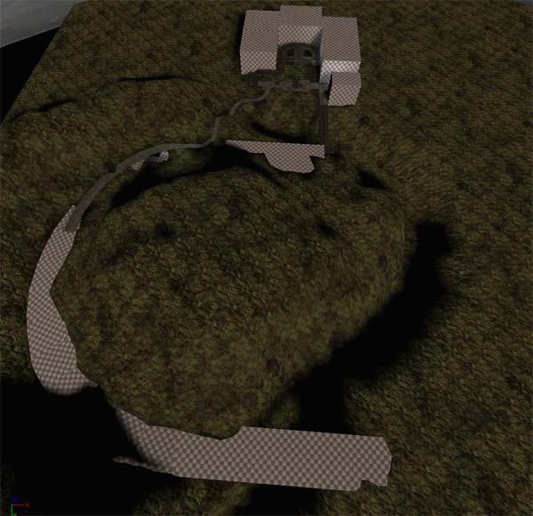
You can see the round defend towers for the turrets. The turrets can cover the 2 main paths. The tank is a pretty good attacking weapon. I need a balance here - Strong attacking force but also strong defence.

We have three paths:
1.) The easy path on the left side goes almost straight to the other side and is very exposed. The tank spawns halfway to the other side.
2.) The path on the right around the mountain is good for fast vehicles and a bit less exposed but longer. Player can drive the tank up and around here.
3.) The third path goes via a cave throught the mountain. This path can only be used on foot or by hoverboard. It is a protected narrow path.
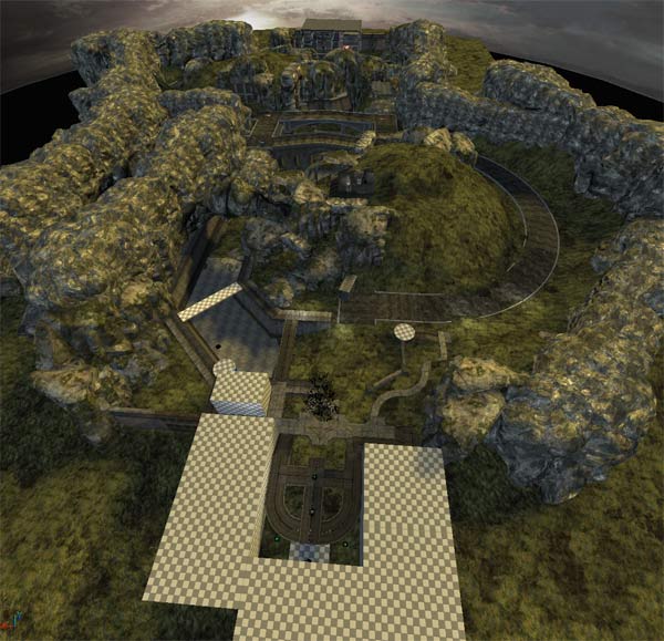
You can see the first idea of the bridge with older style arches. It didn't fit into the theme and was too narrow for the tank. I made a more modern bridge instead (see next screenshot).

Second pass: Static meshes
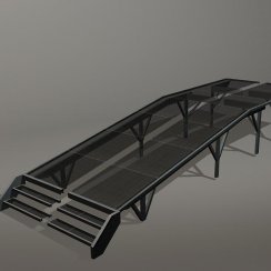
For the next step I created simple static meshes.The bridge is made out of 2 static meshes. One for the base and one for a quarter of the bridge.
There are also road and dam segments visible here. You also can see some recycled segments of the base buildings.


the right path is a bit more protected and bends around in a more interesting way
The left shorter path is a bit more polished now. I removed the giant arc and the BSP floor.
The centre has a simple cave set up in segments and the lifts are operational.
As you can see I added a culling volume as a start for optimizing and checking performance.
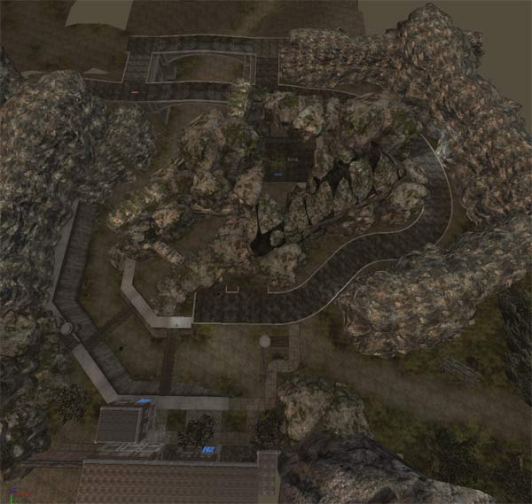
Third pass: Finalising the layout
I played the map against bots a few times and it doesn't suck. I need to organise a test with human players soon.I am experimenting with the post processing and the style a bit.
I want one side being brighter and the other side being more dark. first I thought the blue side should be dark but as the sky is blue I decided to have it the other way around.
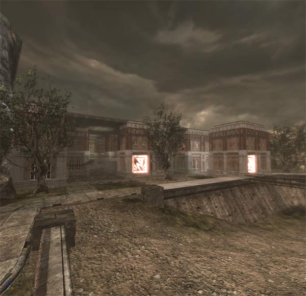
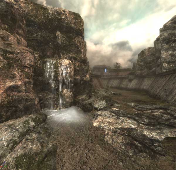
I opened up the roof inside the base and added a building section to make the base more interesting.
The plan is to use the same mesh pieces with different materials for the red and the blue base. Next gen developement is a lot more work. I finally needed to learn how to proper skin a static mesh. Still a lot more to learn on the modeling side.
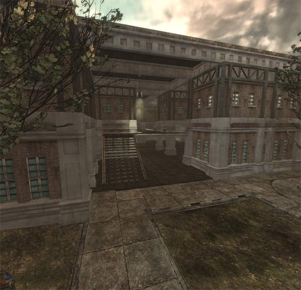
Blue Base: Lighting
I started to work on the lighting. I removed all ambient lighting. So now it is too dark.I also played around with the colour of the bricks and metal beams.
Still not happy about the visuals but it is getting a bit closer to what it should look like
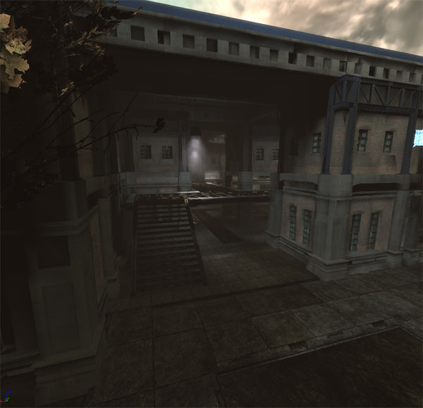
There are many elements affected by the lighting:
- player visibility of cause
- normal maps
- specular
Some vertexes don't receive light and this messes up the look of the meshes. I need to use ligthmaps if this is possible in this version of the engine.
I may leave the blue base for now and move on to some other areas. Looking at it for a week will tell me if it is good or bad.

Bots at least use all possible paths. If I let them play alone my team looses (because I don't do anything). The level is symetrical so there shouldn't be a huge problem with the balance.

Center Area
I left the base alone for a bit and worked on the middle section instead.The road surface is based on a unreal concrete material. I just changed the shader setup. I love the new shader system. It's so powerfull and relatively easy to understand.
As I am using a modular system for the base buildings I made something up quickly for the centre out of these moduls. I will need to make some better moduls later on. These ones look a bit out of place.

This is a quick first pass with mesh modules. I added a few deco meshes from ut3, just to see if they would fit.
There are only 3 different mesh modules used for the tunnels and one is just a version of another with a different floor. Using a bit of bsp for parts of the floor gives variations for now.
A lot of pipes and dripping water would be nice here and good lighting is needed.
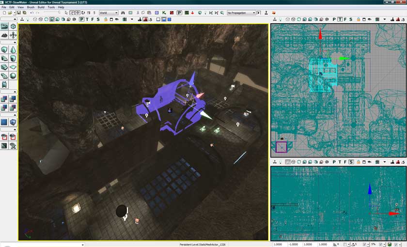
Here is a first try to get the size right
This is work in progress!
I stopped working on this level. It would still need a lot of time to complete. Time I don't want to spend right now.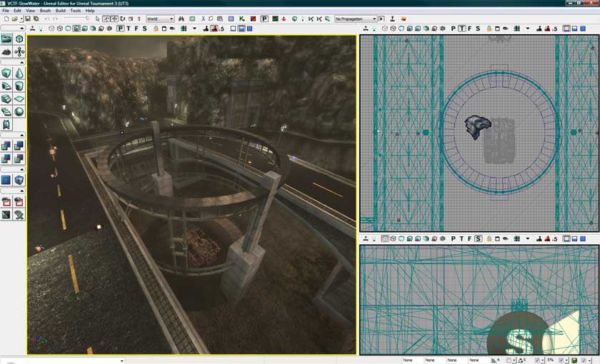
 Top of page