Table Of Content
Quick Guide
Video Guides
Getting Started
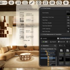
UI Settings
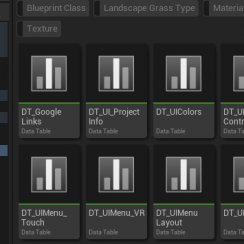
Data Tables
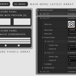
UI Layout
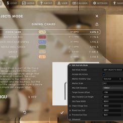
Widget Panels
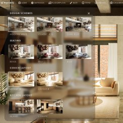
F. w. Preview
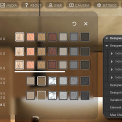
Designer
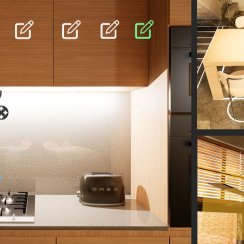
Variation Actor
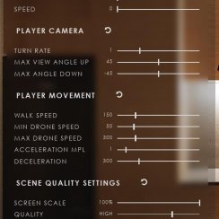
Scene Settings
Blueprints
Gamemode
VR projects
Connect BP
Cost Tracking
Multi-Unit-Prj
Google Data Sheets
FAQ + TIPS
Fix Known Bugs
Version History
UI3 Interface Design Settings
Available Settings that change the look of the interface. Text format, colors used and icons or image sizes.
Translation or Text replacement is covered here too.
- Layout Design - how the UI is arranged
- Design Settings - text format, icon appearance, and colors.
Content:
Quick Guide UI Settings
Watch this quick guide video on YouTube.- Widget Layout Design
- UI Colors
- Text Format
- Icon Replacement
- Text Translation
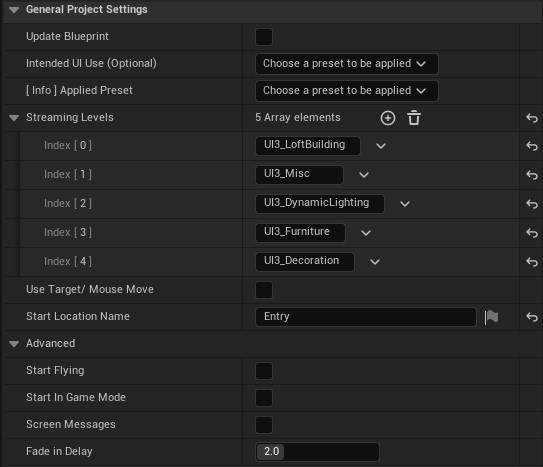
General Project Settings
The blueprint BP_SDOTUI3_InfoMap stores most of the scene specific data. Place it in the level as explained in the Get Started chapter.All settings are entered into the Details Panel, while it is selected in the scene. Most settings have a pop-up explanation when you hover over its name.
Intended UI Use will apply UI design settings that work best for the selected Use. Quality will also be reduced for VR mode.
Streaming Levels are sub levels that are not Always Loaded. You need to add them to the list here even if they are already added in the level browser.
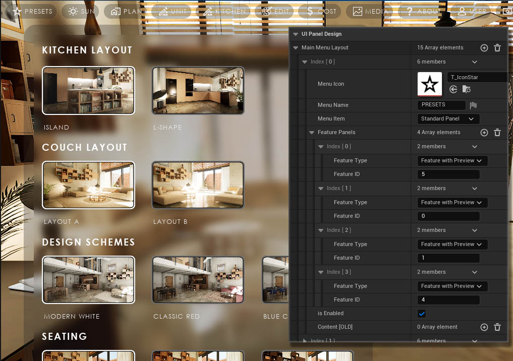
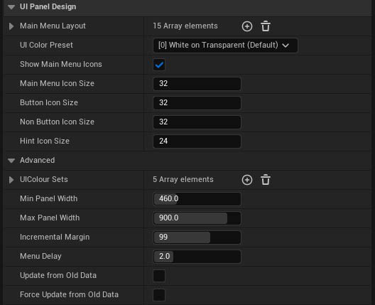
UI Panel Design
The modular UI is created from the data entered into the Main Menu Layout array. The data can also be added into a data table in UI3 versions released after mid 2025.- Each Index or Data Table Row will appear as a menu button from the left side to the right.
- Icons can be set to hidden by unticking Show Main Menu Icons
- Text can be left empty to only show the icon
- Menu Item can be set to a simple button for Quit or Screenshots. This might now work for Gamepads or VR controllers.
Main Menu Icons can be hidden for all main menu buttons and their size can be defined.
Button Icons can be set separately. Hint Icons are the icons that show up in the Edit Mode widget.
Min and Max Panel width affect all widgets. Incremental Margin multiplied by the button index is the distance of the widget panel from the left screen edge.
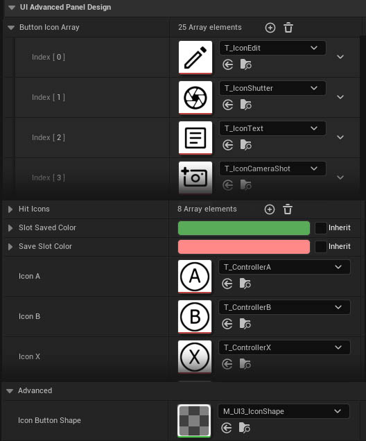
UI Advanced Panel Design
Icons are stored here in arrays or single settings. Icons are black on white background. The UI uses a material that will apply the UI colors.Custom Icons can replace default icons. But the order of the icon in the array needs to stay exactly as it is or the wrong icon will be shown in the UI.
Advanced exposes the shape materials used for buttons and images. Changing the values may have unexpected results and isn't recommended unless you are an experienced UI designer.
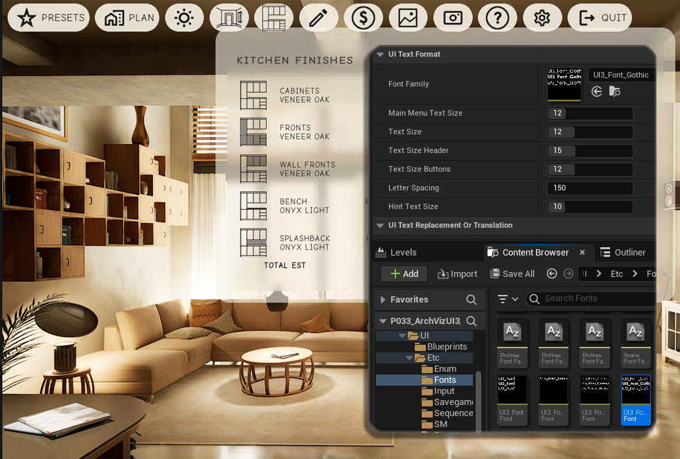
UI Text Format
Font Family replaces all text used in the UI. Fonts are available in UI / Etc / Fonts. The will appear in the drop down list.Not every font will work in Unreal. It seems to be easier to set up fonts that are generated the "font family" way. A default and a bold version is used in the UI.
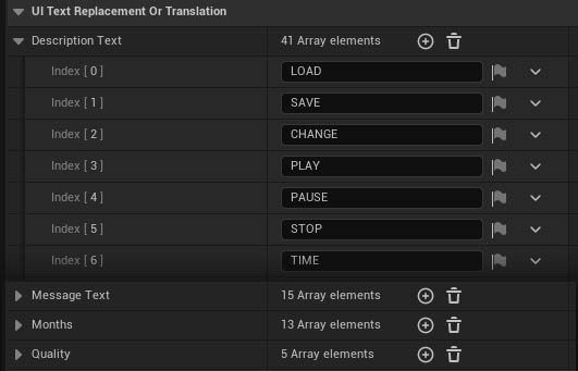
UI Text Replacement or Translation
All fixed text that appears in the UI can be replaced here.Translation should be possible with special non-English letters and symbols being supported as long as Unreal supports those.
 Top of page
 UI3 Design in Detail