Table Of Content
Quick Guide
Video Guides
Getting Started
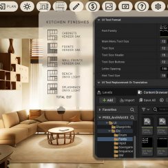
UI Settings
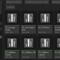
Data Tables
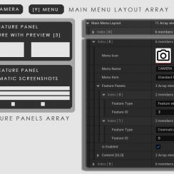
UI Layout
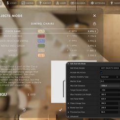
Widget Panels
F. w. Preview
Designer
Variation Actor
Scene Settings
Blueprints
Gamemode
VR projects
Connect BP
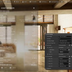
Cost Tracking
Multi-Unit-Prj
Google Data Sheets
FAQ + TIPS
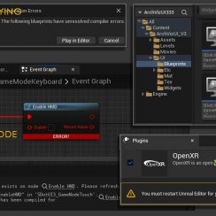
Fix Known Bugs
Version History
UI3 Feature Widgets Overview
Overview of all available feature widgets in the UI.
In order of their appearance in the Info Map.
Some features have their own detailed page.
Content:
Features with Preview Image
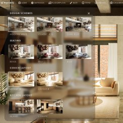
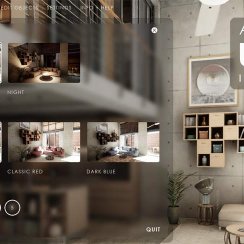
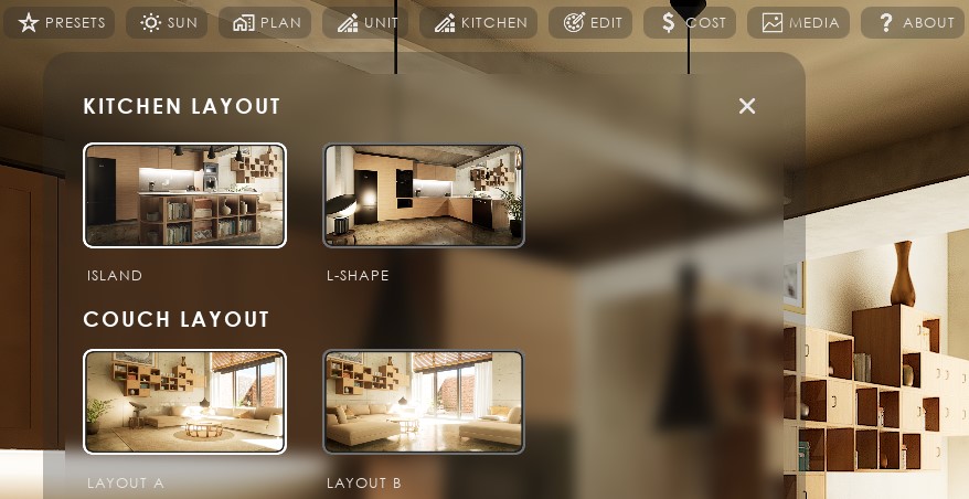
Features with a Preview include- Design Schemes - Changes all Variation Actors
- Variation Groups - Changes groups of Variation Actors
- Scenarios - Replaces sub levels
- Sequence Player - Plays animations
- Scene Travel - Loads another scene
Follow the link for more information about these features
Button Features
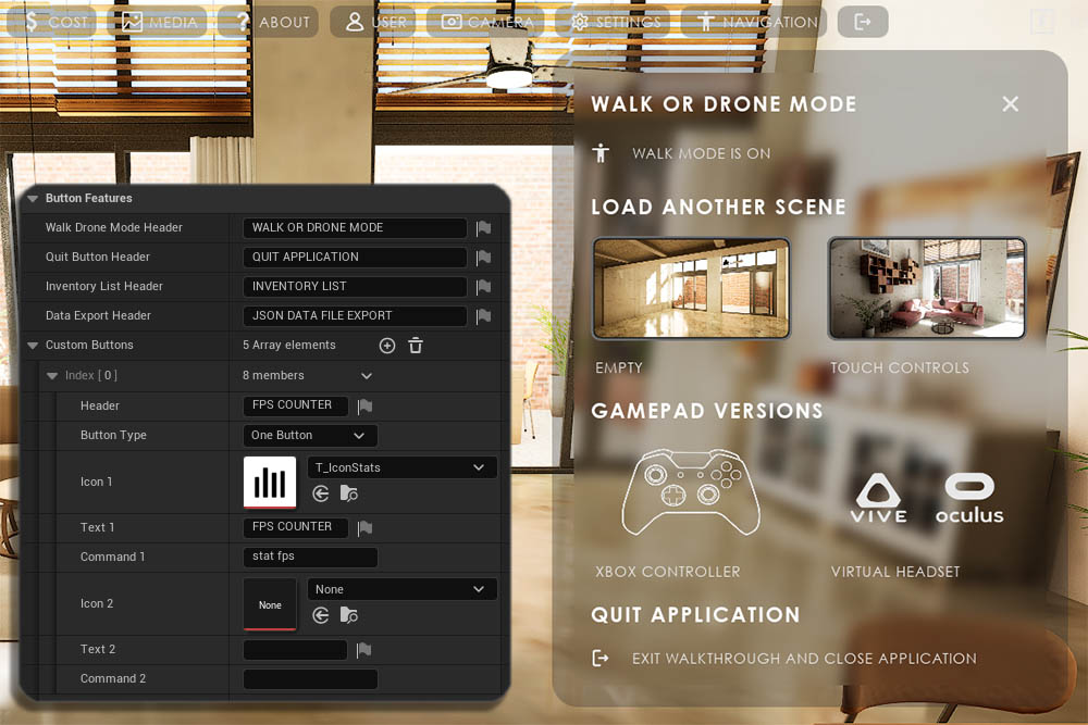
Button features other than the Custom Buttons have no settings except the name of the header.Custom Buttons
Buttons that can be used to execute a console command. 5 Button features are pre-set with debugging options as examples. Hit (+) to add more custom button features.
Use the Index as the Feature ID to identify the button in the Main Menu Layout array.
Custom Button features come with one or two buttons. The Button Type defines the number of buttons and their behavior.
Command 1 / 2 are command lines that are executed when the button is clicked.

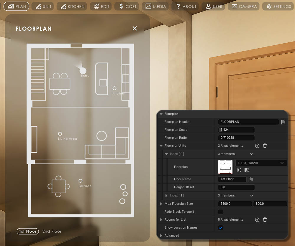
Floorplan
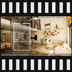
The interactive Floorplan will show the player's position in play mode. Buttons can be added by placing BP_UI3Location blueprint actors into the scene.The Floorplan Scale is used to align the floorplan size with the building in the scene.
Floors are added in the Floor or Units array. Start with the lowest floor in the scene and then add floors above it in order. The Height Offset is measured from the lowest floor.
Rooms for List can categorize reports. They can be floor names (ground floor) or any other name (Bathroom, Backyard). They are defined here and their index is used in Variation actors.
Face Black Teleport is the preferred form of moving the player in VR applications.
Edit and Info Mode
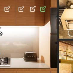
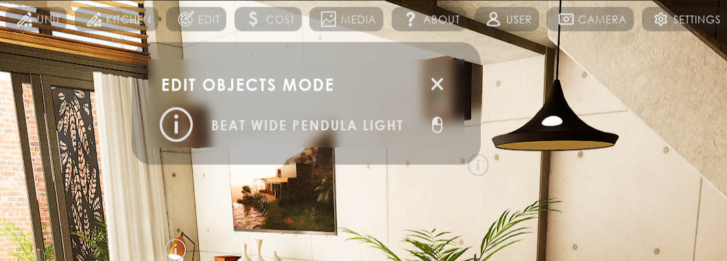
Edit Mode lets the user interact with the scene. Use- BP_SDotUi3_Variation to change an object or interact with it.
- BP_SDotUI3_ObjectInfo to get some information about an object.
A Dot will appear on the object and the name will be displayed, if it is editable.
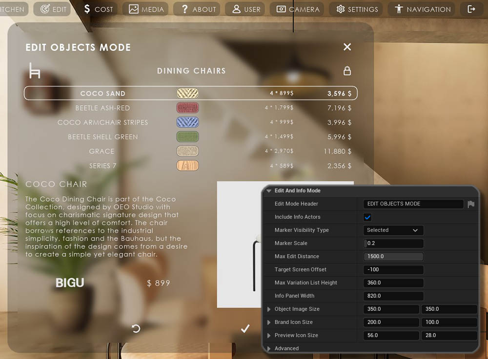
Variations can have
- just their names in a list
- prices or a preview icon next to the name
- an info widget added
Depending on the settings in the linked Variation Actor.
Variation changes will appear in the scene immediately.
Clicking the OK icon will accept the change and close the widget. Clicking the X icon will cancel and revert to the previous variation.
Cost Tracking
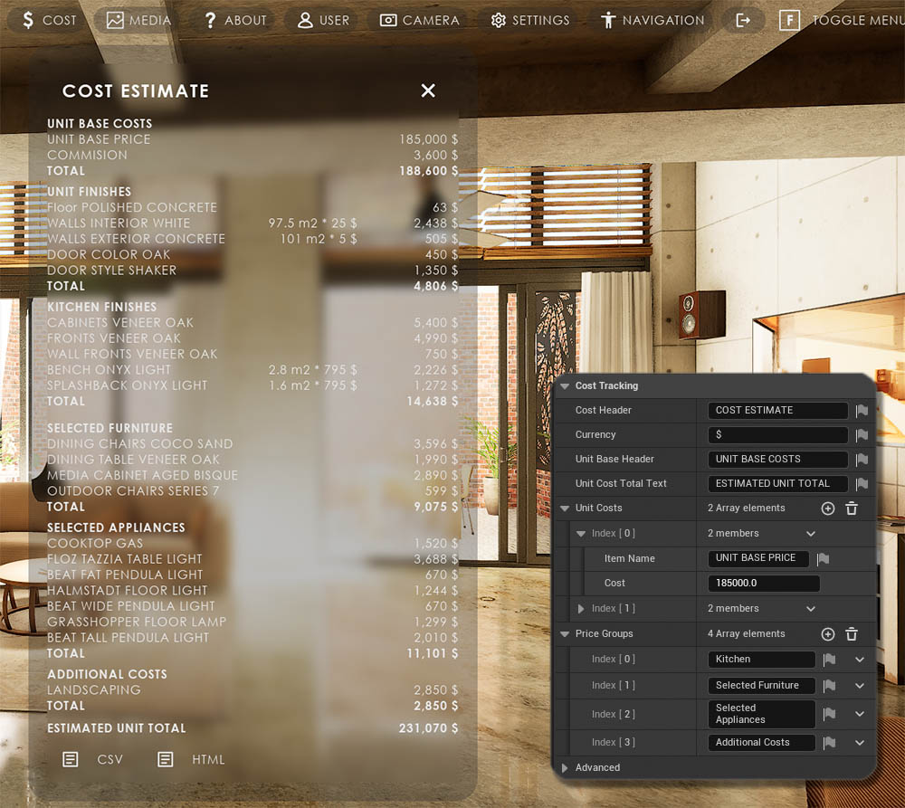
The Cost of the items in the scene can be tracked and displayed. The price of an object may change as soon as the object changes. The Cost Tracking widget keeps track of changes and always shows the current costs.Unit Costs are costs that do not change for the scene. They can be entered in the Unit Costs array.
Cost Groups are used in reports and the widget to categorize the list. The Variation Actor uses the ID of the group.
Most of the costs will be entered in the Variation Actors.
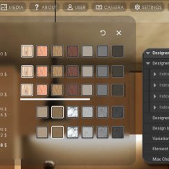
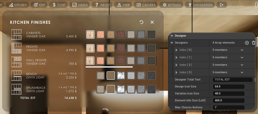
Designer
A Designer can- Modify assets that are spread out over the scene, like doors.
- Modify meshes and their materials independently from each other.
- Connect to other blueprints, like the Interactive Doors BP or the Modular Kitchen Builder BP that are sold separately.
User Manager and Saves
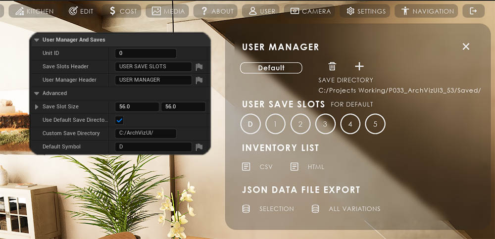
User Manager
Press the '+' symbol to add a new user or select the user name in the list and press the bin icon to delete a user.
User Save Slots
The first save slot has the default settings saved and can only be loaded.
5 slots are available for every user. Save by hovering over the outer ring until in turns red. Load from a slot by clicking at the center of the slot. Slots with data will appear green at the center when hovering over it.
About Project and Help
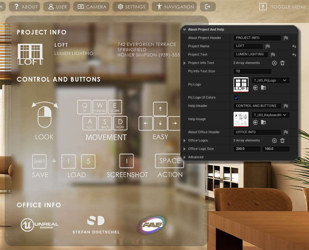
UI Colors ticked will use the UI color scheme to integrate a logo into the UI. The logo needs to be a black icon on a white background.
About Project
Information about the project, like the address and contact details
Help
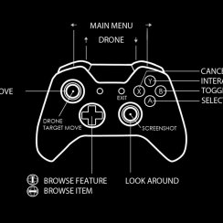
Display an image to explain the current control scheme. Images are available in the 'Tex' folder.
Office Logos
Add one or more office logos.
Project Media
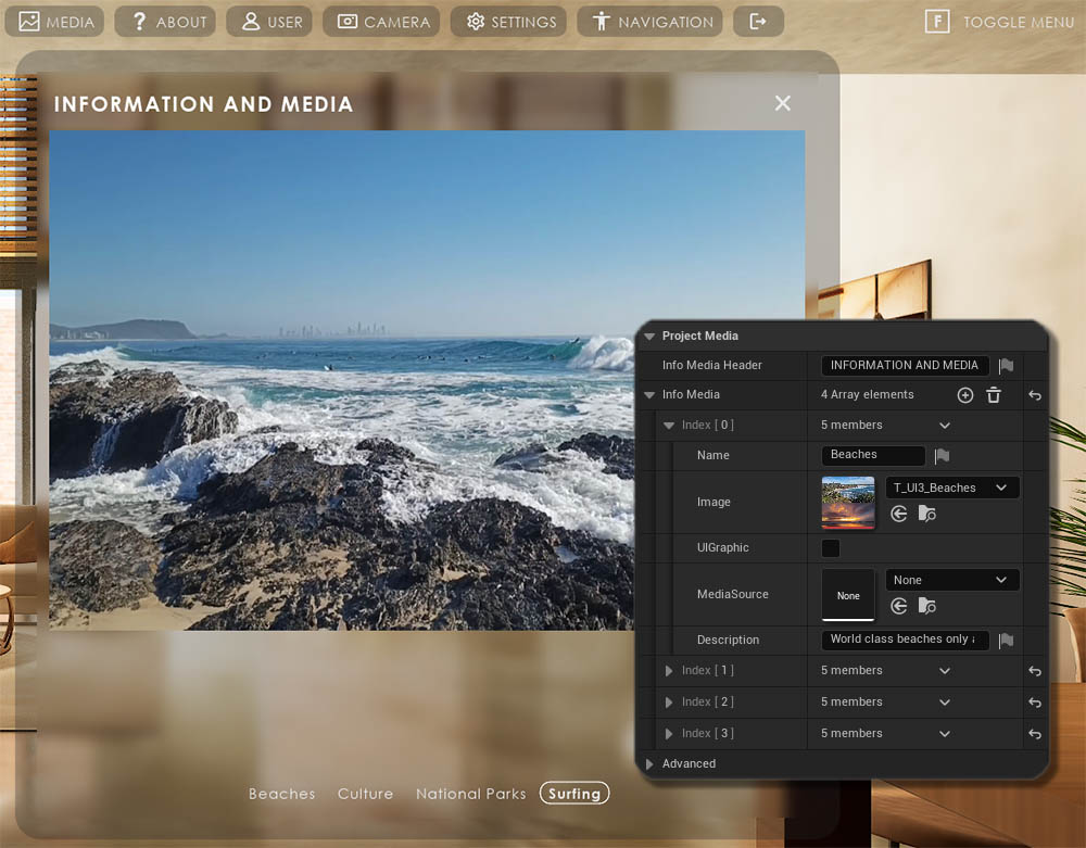
Images or Videos can be displayed. A small text can be added underneath the image.Media Source is a Unreal video file. It gets created when a video file is dragged into the content browser. The video needs to be in Content / Movies to be packaged automatically. Otherwise, the movie's directory needs to be added to the list of non-asset directories in the project settings.
Media Source files will overwrite the Image file if both are added to the same array element.
 Top of page
 Read more about Features With Preview